Startup Wars
Build an Interactive platform for the education of business entrepreneurs
MyRole
UX/UI design, Prototyping, Testing, Asset designer
Timeline
1 year 4 months
Overview
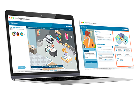
The Product
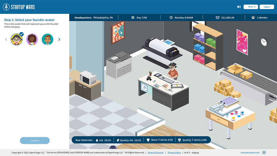
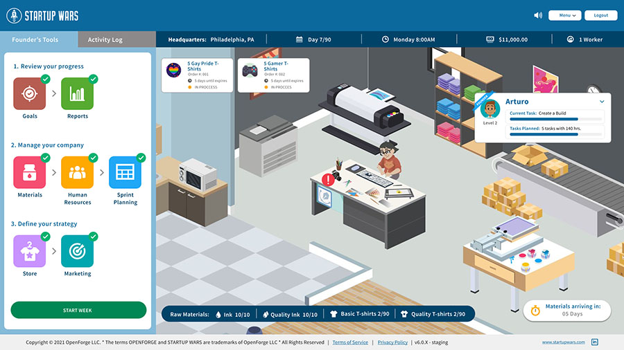
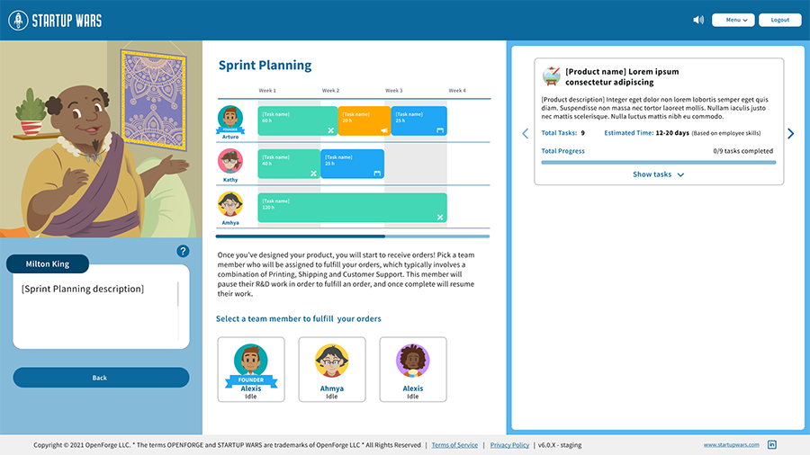
A Web App simulation game for management and entrepreneurship primarily focus for business students and universities. The game consists in create and manage a startup company and complete predetermined goals established by the teacher (game host). Many of the settings of the game like "days to achieve", difficulty and other goals are to be managed by the teacher or the person with access to a web dashboard that serves as a control panel and can see the progress of each student on the game.
Background
The concept of Startup Wars started as a simulation game for IOS and Android, focused on the creation and management of a small startup and with the goal of reach certain monetary goals in a fix amount of in-game days. The user would in charge of hiring and managing employees, assign tasks, managing monthly company expenses.
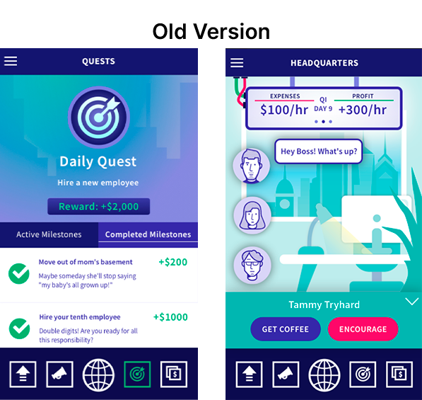
When I joined in 2020, I was part of a team of 4 designers and the project was starting a big push on the design aspect. During my time here, I supported design across every aspect of the project and have grown tremendously as a designer.
Some key achievements we managed as a team were:
Improve usability across the app:
No usability tests were conducted by any external consultancy before dev handoff. We worked together with the dev team to have weekly usability testing and improve on it constantly.
Establishing a design kit:
This has helped us to maintain consistency in the look and feel across the different modules of the app and other parts of the project.
Design Process
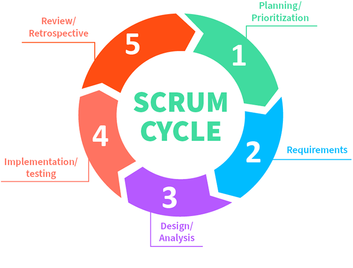
Our process for Startup Wars was based on Iterative Scrum Process. We aim to incorporate a process cycle that lets us improve constantly via constant feedback and iterations.
Understanding the problem
Before me entering the project and even before the my design team was properly established, there was already an alpha testing of the app, and we were in the process of working the 3.0 version of it.
Key problems to work on where usability issues as well as a confusing user flow generated for the number and complexity of features the game had.
In later iterations, the project had a shift of focus, changing to more educational purposes, the app was expanded to a learning platform for entrepreneurship students in universities. This needed a rework of user flows and added a new element in the form of a web dashboard.
Gathering insights
After initially collecting data of user research in the form of alpha testing and surveys, we conducted affinity mapping to synthesise and group the problems identified.
Over the course of the project iterations, the gathering of user research has expanded tremendously. We started working together with universities, and this gave us the opportunity to gather a great amount of data directly from future end-users.
We review the data given to us and create a list of usability issues in order of priority. The severity of a usability problem is a combination of three factors:
Task criticality
How important is the task for the user?
Impact
How much of an impact does this issue have on the user's experience?
Frequency (%)
How many times does this come up out of total participants?
Prioritisation of issues
After categorising these problems, grouping them and translating them into manageable tasks, we needed start addressing the key areas from a usability standpoint.
After the Product, Design and Development teams dig deep into these problems, it came to the conclusion to rework and simplified the structure of the user flow. The cost of this was the removal of features, but the upside would be a more focused approach to the usability problems. This needed a new simplified game loop, but the cut content could be added in later iterations with a better base structure in place. This decision will also lighten the load in the Dev team, making it easy to iterate the product faster and also receive feedback quickly.
Applying Solutions
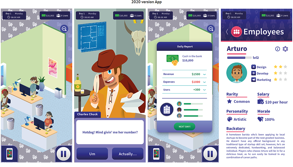
After the scope of the work was narrowed and focus. We, the design team got into action to create a clean ear user experience with better usability and a simple but fun game loop. In this stage, as the design team was not divided into specialties, I was part of the UX and UI design as well working game design and, thanks to my background as an illustrator, the asset design.
Testing the product
When the first iteration of this new version of the game was completed, we had for the first time, the opportunity to receive feedback from the end-users directly, in this case, university students, as a deal with the Drexel university in Philadelphia was completed to beta test the product with a pilot group of 60 students and 2 teachers.
Weekly closed beta testing was also done by our QA testers, as well as for the Design team. Half the time spend for our and the QA team was to corroborate problems and feedback from our pilot group.
What's next?
As of now, after more than 3 years of live for the product. It has expanded in scope with each iteration, leaving the mobile devices and migrating into a Web App. Old modules and features that were cut when the product was reworked, has now been implemented again and where the product had at the beginning of the beta testing just one pilot group, it now has clients in various universities in the US.
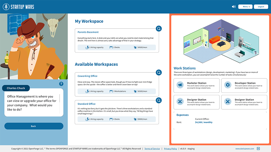
2023 version App
